How to Set Axis Range (xlim, ylim) in Matplotlib

Introduction
Matplotlib is one of the most widely used data visualization libraries in Python. Much of Matplotlib’s popularity comes from its customization options – you can tweak just about any element from its hierarchy of objects.
In this tutorial, we’ll take a look at how to set the axis range (xlim, ylim) in Matplotlib, to truncate or expand the view to specific limits.
Creating a Plot
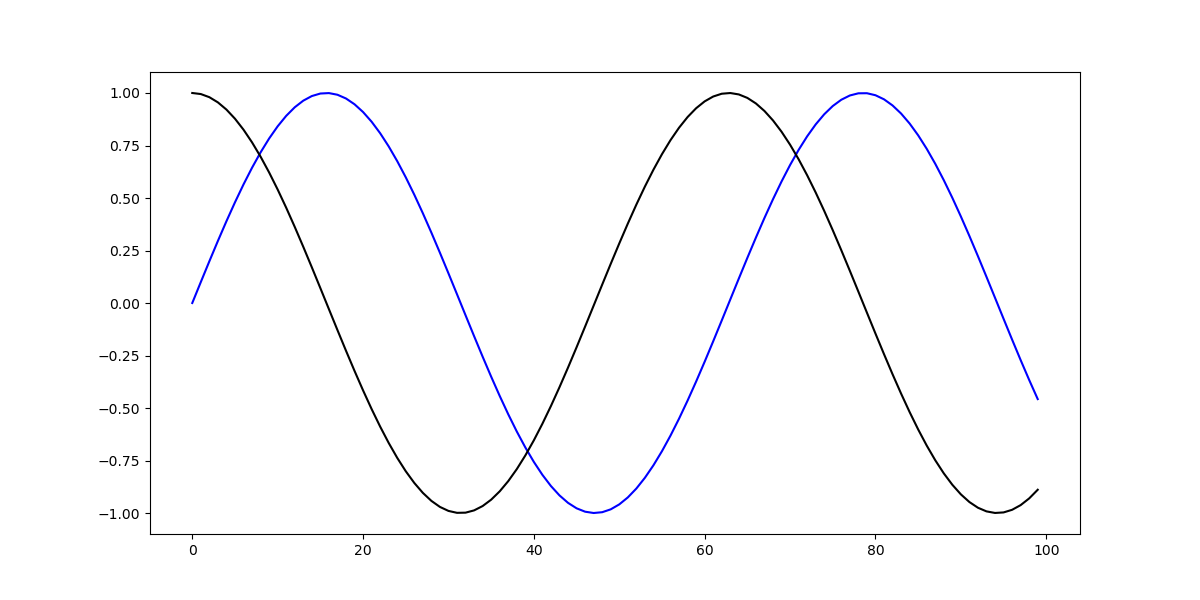
Let’s first create a simple plot:
import matplotlib.pyplot as plt
import numpy as np

fig, ax = plt.subplots(figsize=(12, 6))

x = np.arange(0, 10, 0.1)
y = np.sin(x)
z = np.cos(x)

ax.plot(y, color='blue', label='Sine wave')
ax.plot(z, color='black', label='Cosine wave')

plt.show()
Here, we’ve plotted two sine functions, starting at 0 and ending at 100 with a step of 0.1. Running this code yields:

Now, we can tweak the range of this axis, which currently goes from