Data Visualization with the Caret R package

Last Updated on August 22, 2019
The caret package in R is designed to streamline the process of applied machine learning.
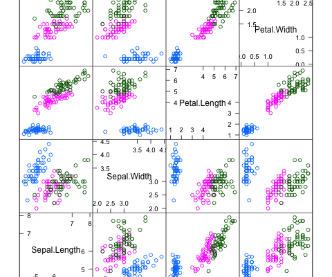
A key part of solving data problems in understanding the data that you have available. You can do this very quickly by summarizing the attributes with data visualizations.
There are a lot of packages and functions for summarizing data in R and it can feel overwhelming. For the purposes of applied machine learning, the caret package provides a few key tools that can give you a quick summary of your data.
In this post you will discover the data visualization tools available in the caret R package.
Kick-start your project with my new book Machine Learning Mastery With R, including step-by-step tutorials and the R source code files for all examples.
Let’s get started.
Caret Package
The caret package is primarily used for streamlining model training, estimating model performance and tuning. It also has a number of convenient data visualization tools that can quickly give you an idea of the data you are working with.
In this post we are going to look at the following 4 data visualizations:
- Scatterplot Matrix: For comparing the distribution of
To finish reading, please visit source site